You can't manage what you can't measure: Data about data people
A show & tell on collecting and analysing Data Community stats. Trigger warning: Microsoft Teams are praised in this article.

“You can't manage what you can't measure”
Peter Drucker said it decades ago. Still rings true today.
In my last piece, I shared tips on running Data Community sessions. This time, I’m putting the quote to work with a Power BI report I built to track attendance.
Why? Well, why not?
A Data Community that isn’t data-driven? That’s like the shoemaker’s kids going barefoot. We’re too often busy building insights for everyone else and not ourselves.
So let’s do it properly. I’ll use the Information Product Canvas to frame the business questions, then show you the report, and finally share how you can build your own.
Let’s dive in.
What? Who uses Microsoft Teams?
Well. I do. And so does my company and all my past employers. Microsoft has a strong presence in New Zealand.
Simply - I haven’t had the chance to work anywhere “cool” enough to use Slack. Yet - I live and breathe just fine.
Even in the face of some fun memes on LinkedIn, like this one:

Now, I don’t exactly “love” Microsoft Teams, but I do like the meeting attendance report feature. Meanwhile, I have not found an equivalent function in Slack Huddles.
Take that, MS Teams haters! (PS: There may be some 3rd party tools for Slack, feel free to let me know in the comments.) This video shows how to download & export the reports.
Why I built the report
Weekly sessions meant I quickly had a pile of CSVs. So I thought, why not feed them into Power BI?
I’ll admit, I built the report first and the canvas later. Since it was my own time, the risk was low. Sometimes, “this could be fun” is reason enough.
What I learned along the way: what questions it can answer, and what actions it supports.
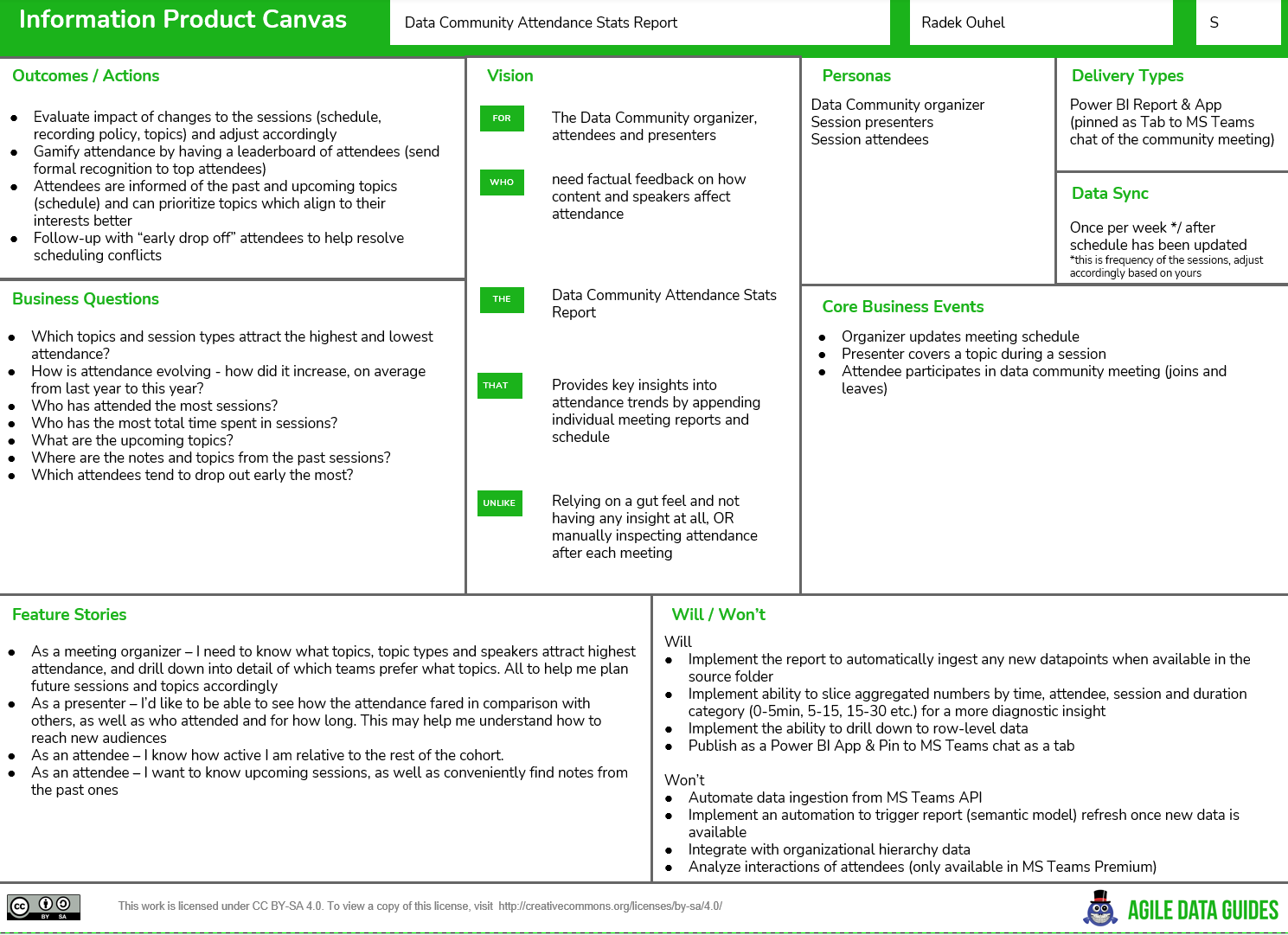
Business questions
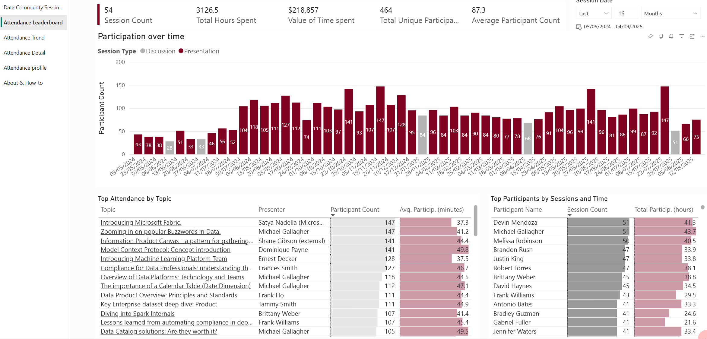
Which topics attract the highest and lowest attendance?
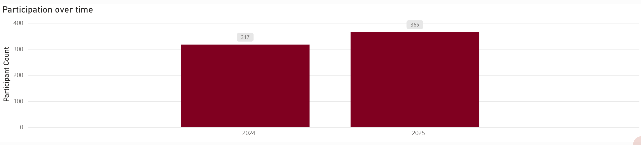
How is attendance evolving? How did it increase on average from last year to this year?
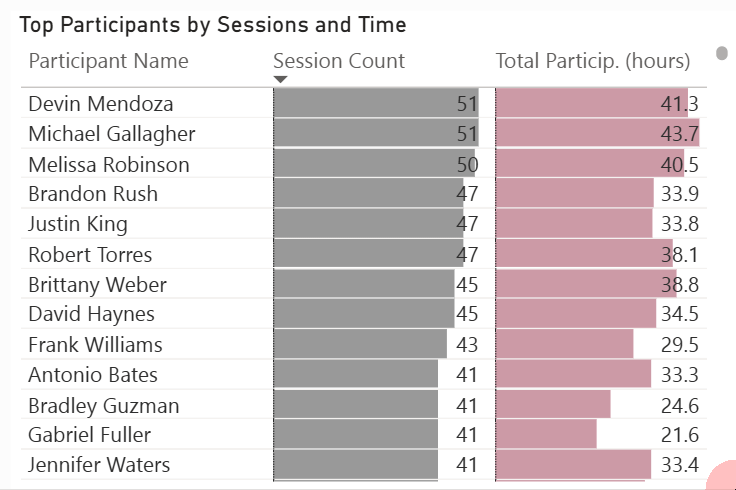
Who has attended the most sessions?
Who has the most total time spent in sessions?
What are the upcoming topics?
Where are the notes and topics from the past sessions?
Which attendees tend to drop out early the most?
Outcomes / Actions
Evaluate the impact of changes to the sessions (schedule, recording policy, topics) and adjust accordingly.
Gamify the attendance by having a leaderboard of attendees (send formal recognition to top attendees).
Attendees are informed of the past and upcoming topics (schedule) and can prioritise topics which align with their interests better.
In the Will / Won’t - I explicitly called out what is outside of scope for the moment - we will return to some of these in the last section of this article, where I’ll focus on potential improvements and additions.
Report in action
Let’s go back to the business questions above.
One of my favourite things about Power BI is that you can design report pages that can answer multiple questions at once. All by passing down and customising filters, sort orders and more:
1. Which topics attract the highest and lowest attendance?
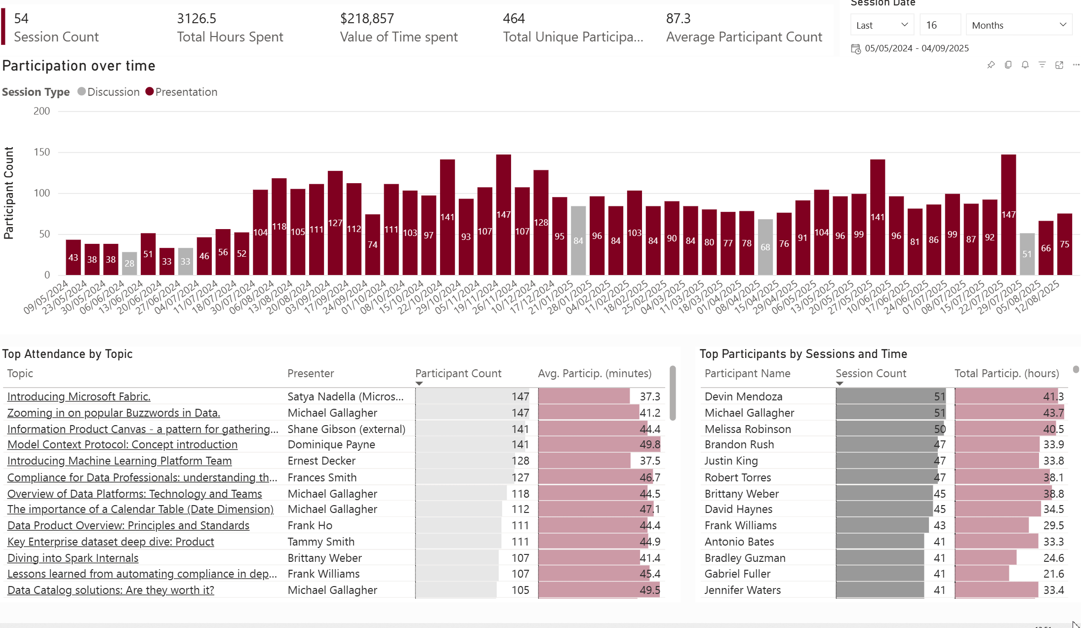
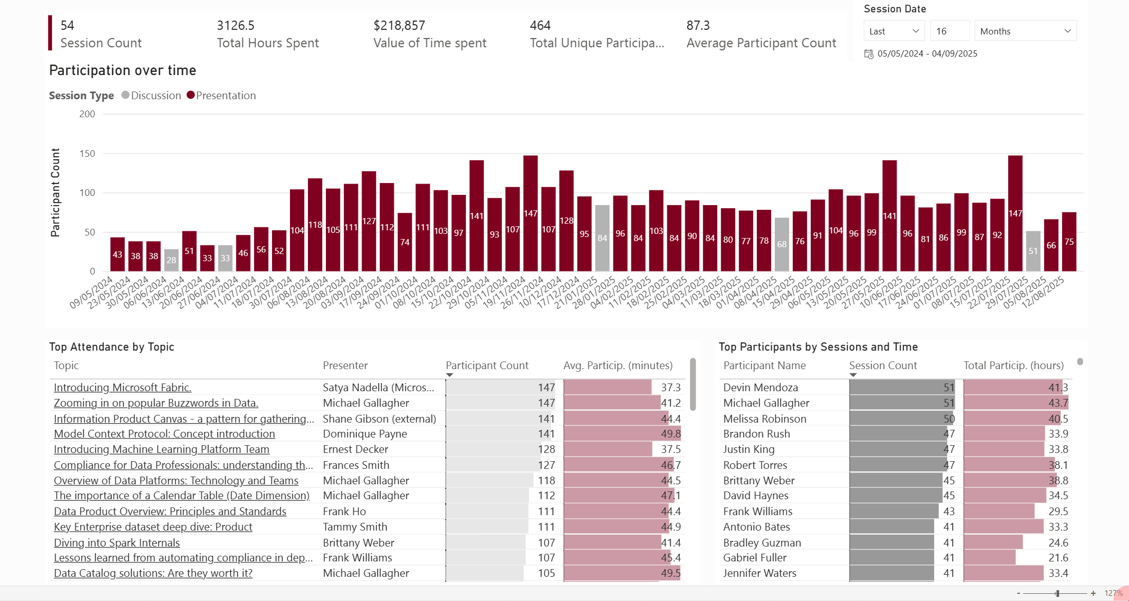
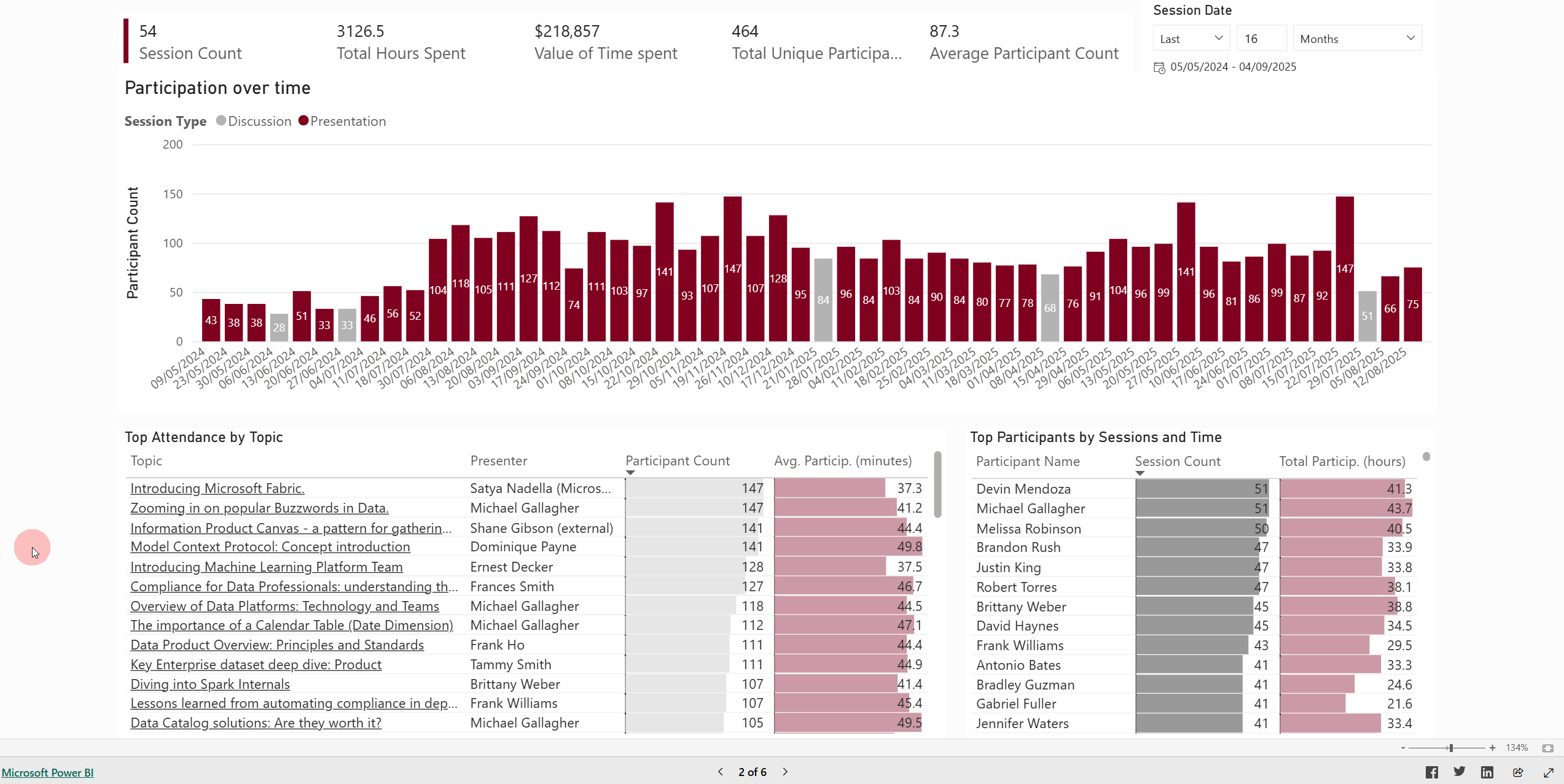
CTRL + Click to select the highest attendance bars and the common theme reveals itself - sessions to do with “fun” (buzzwords), external guests (Microsoft, AgileData) and trendy topics like Model Context Protocol.
We also see that “discussion” session types are relatively less popular in terms of numbers. They are good to have now and then, though.
Alternatively, we can scroll up / down the session list, which is already sorted by Participant Count by default. Or sort it by Participation minutes if we please:
2. How is the attendance evolving? How did it increase on average from last year to this year?
Despite apparent seasonality (the 1st quarter was affected by Christmas and holidays in New Zealand), the overall trend in unique participant count is upward.
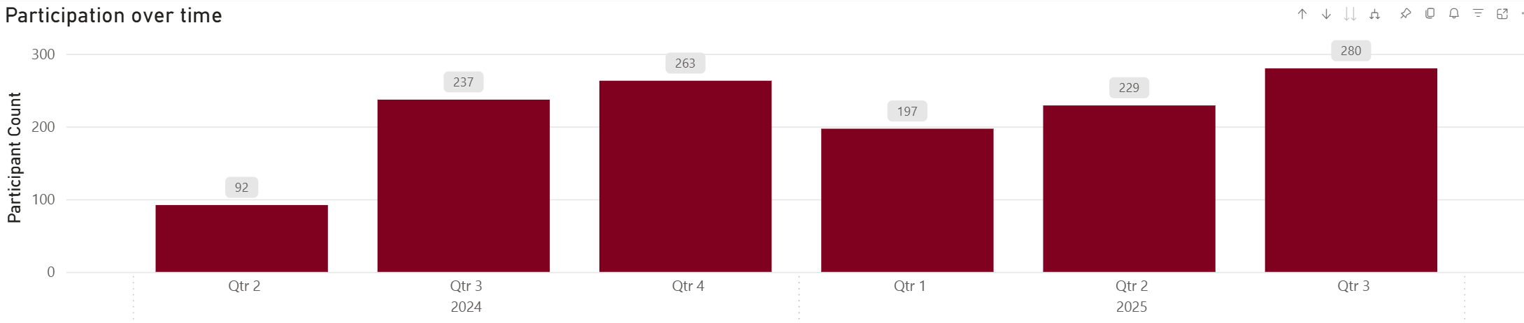
And of course - we can inspect it in a yearly, quarterly and monthly detail thanks to the “expand hierarchy” button:
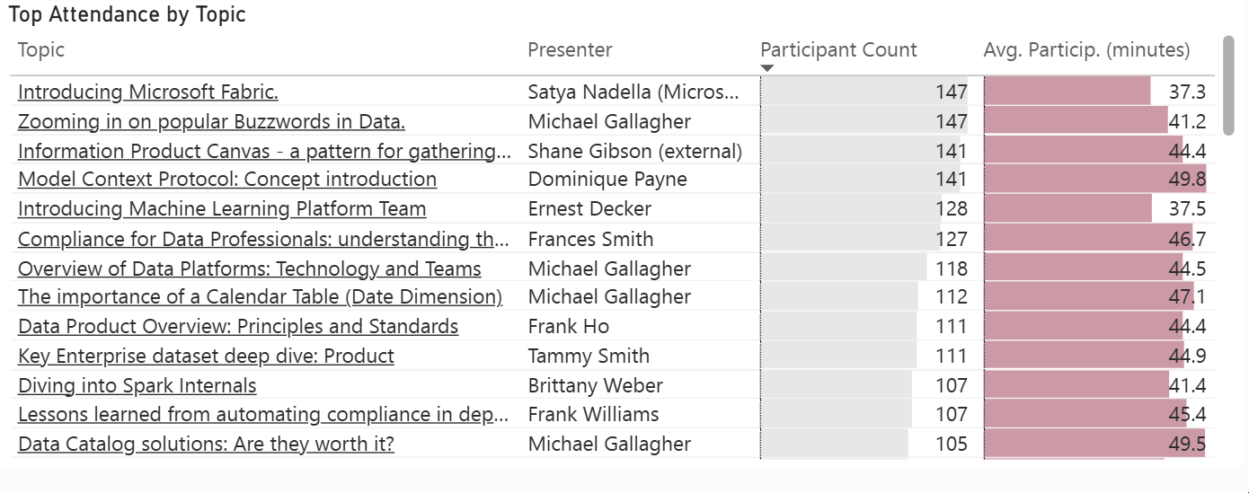
3. & 4. Top attendees by time spent and number of sessions
Zooming in on the customers/stakeholders of the data community. By Session count or Participation time - top or bottom - all available on the same page using just a couple of clicks:
On top of that, with the report tooltip pages, I can simply hover over any participant and get an attendance profile, highlighting which sessions were skipped and the time spent in a given session by topic:
4. & 5. Upcoming and past sessions, session notes
I hear you - this is not really an analytical insight. That said, since I need the session schedule to put some important context behind the attendance reports (the only other table in the model outside of the attendance reports - will get to it), why not display it on a dedicated page?
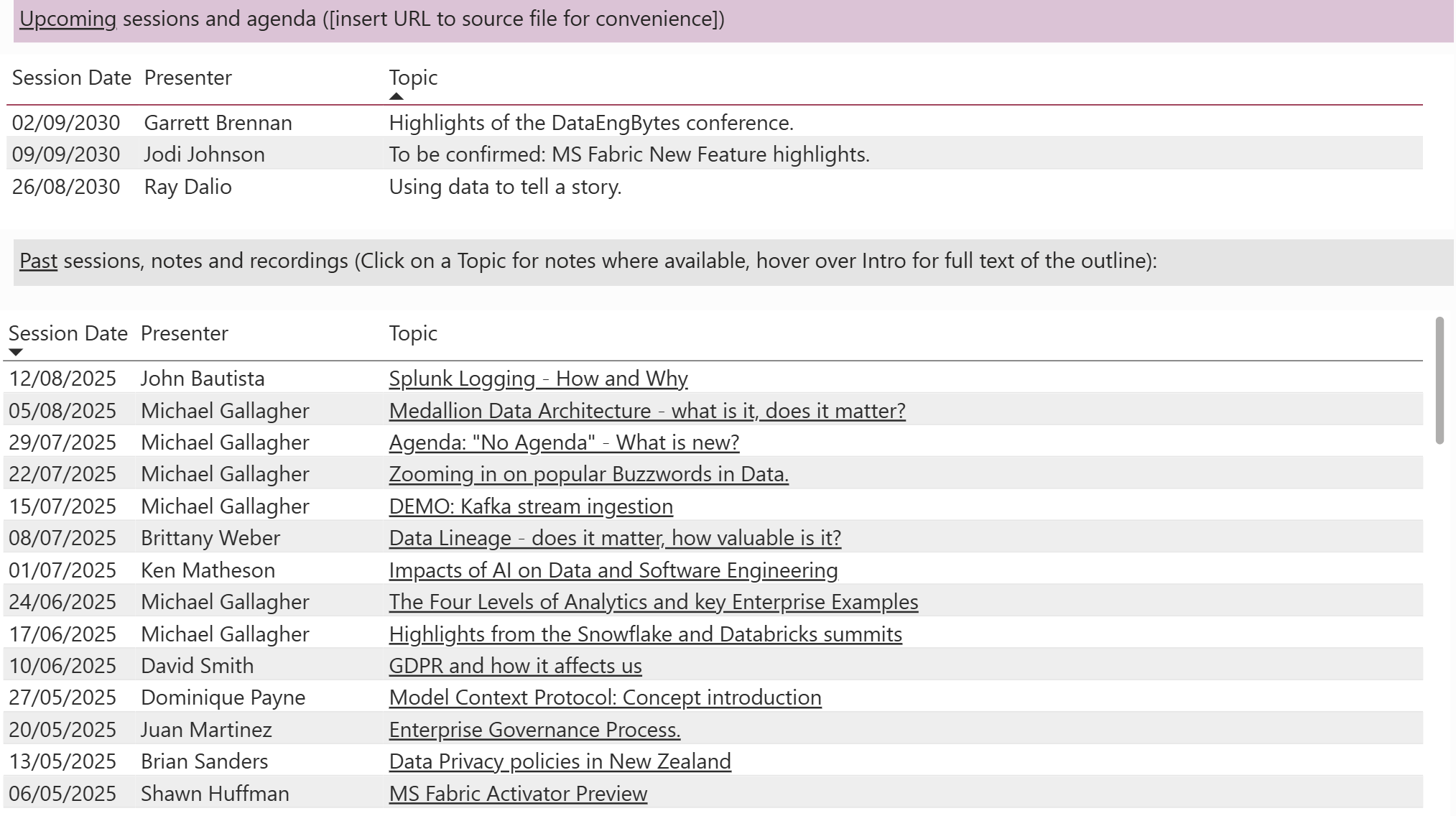
Where available, past Topic items become a hyperlink to session notes or recording.
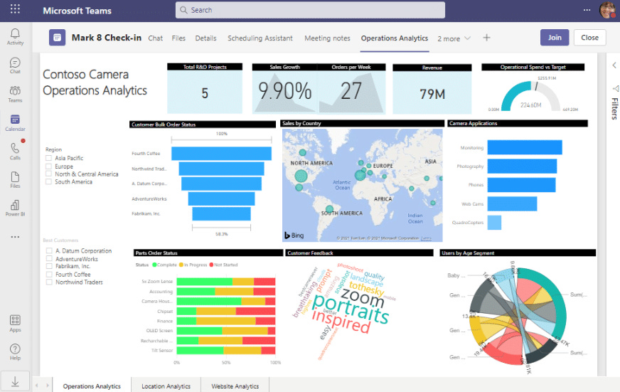
You can also embed the Power BI report as a new tab in your Microsoft Teams chat - ensuring everyone always has the agenda at their fingertips. Microsoft may not always have a best-in-class product, but the ecosystem effect is very useful in situations like these.
6. What proportion of attendees tend to drop out early?
With a quick DAX calculated column in my Semantic model, I create the below category to group attendance into buckets:
Participation Time Category =
SWITCH(
TRUE()
,'Session Attendee'[Participation Time (minutes)] < 5, "0-5: can't stay / not for me"
,'Session Attendee'[Participation Time (minutes)] <= 15, "5-15 minutes: here for a bit but had to jump off"
,'Session Attendee'[Participation Time (minutes)] <= 30, "15-30 minutes: here for some of it but had to jump off"
,'Session Attendee'[Participation Time (minutes)] <= 45, "30-45 minutes: been here for most of it"
"Over 45 minutes: stuck around for most of it"
)
With that, I can now filter by this category - either interactively in a dedicated page:
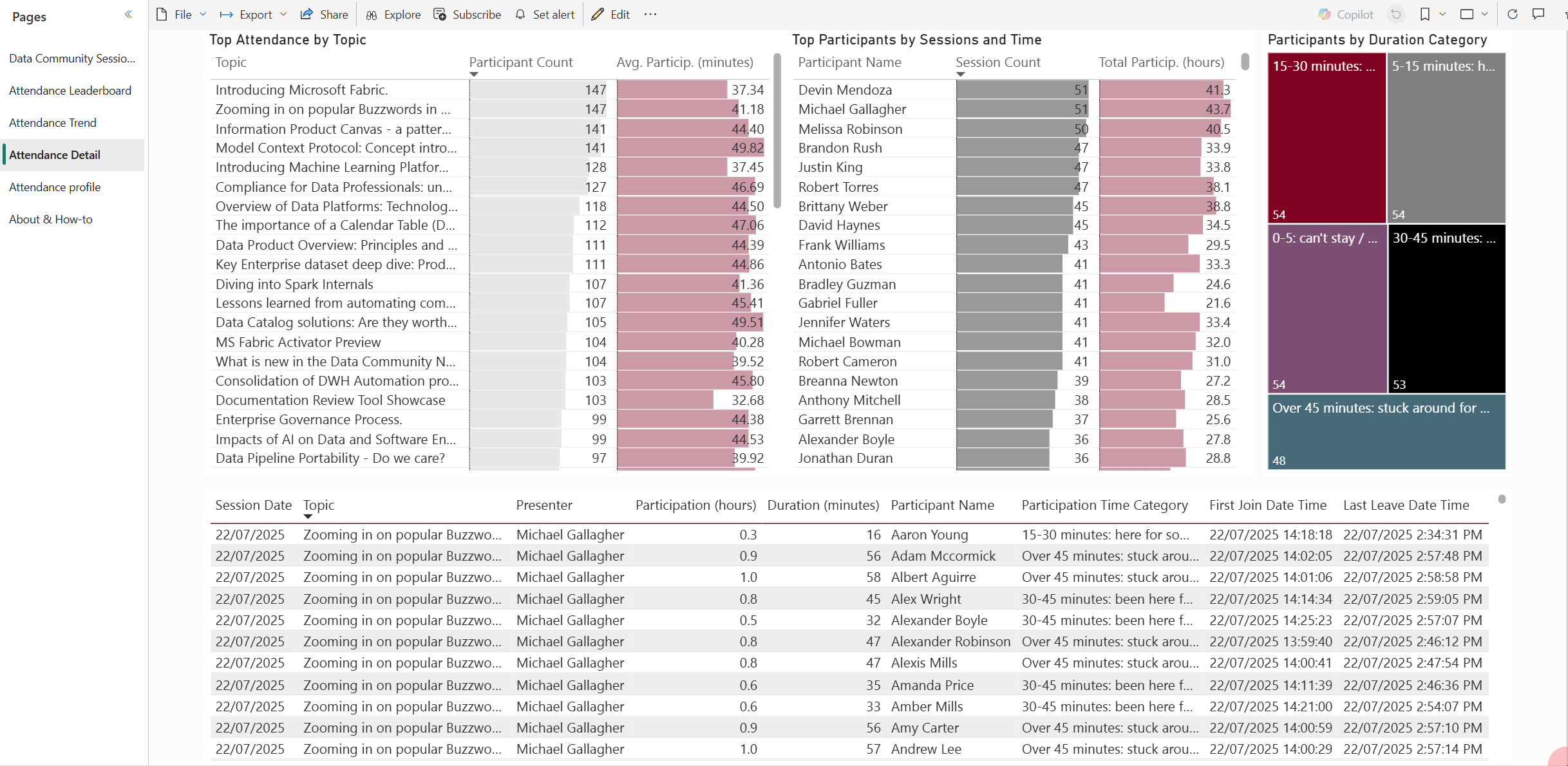
Or in a page-level filter on the main leaderboard one:
Closing comments on the report
In the snippets and GIFs above, you would have noticed a couple of touches - such as expressing the overall attendance in monetary terms (that is, the opportunity cost of folks attending - keeps me honest in ensuring topics add value), high-level stats and other pages that offer alternate slices across the data.
Last but not least - I’m a firm believer that each report requires a drill-through to row-level data. Many scientific studies have proven that this will, on average, prevent 5 out of 10 exports into Excel (I totally made that up, but I would like to believe it).
Here is how that looks:
Check it out for yourselves!
URL to the live version of the report using Power BI’s Publish to Web:
Under the hood
Simplified data flow diagram below:
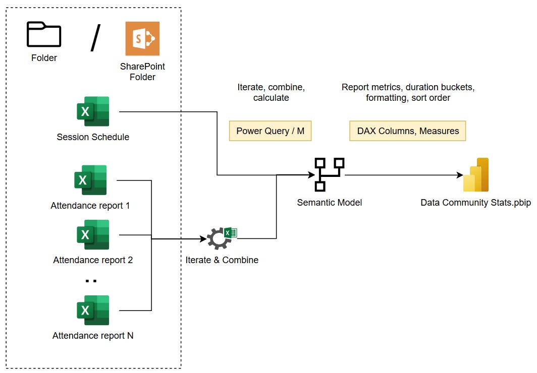
Pre-requisites - what tools do you need to set this up?
Power BI Desktop (Free, available on Windows OS only).
To publish with colleagues, embed to teams, and save yourself some trouble with ingestion, Office 365 Business Subscription will give you SharePoint Online and MS Teams. A Power BI Pro license or higher is required for sharing reports via the Power BI Service.
Data
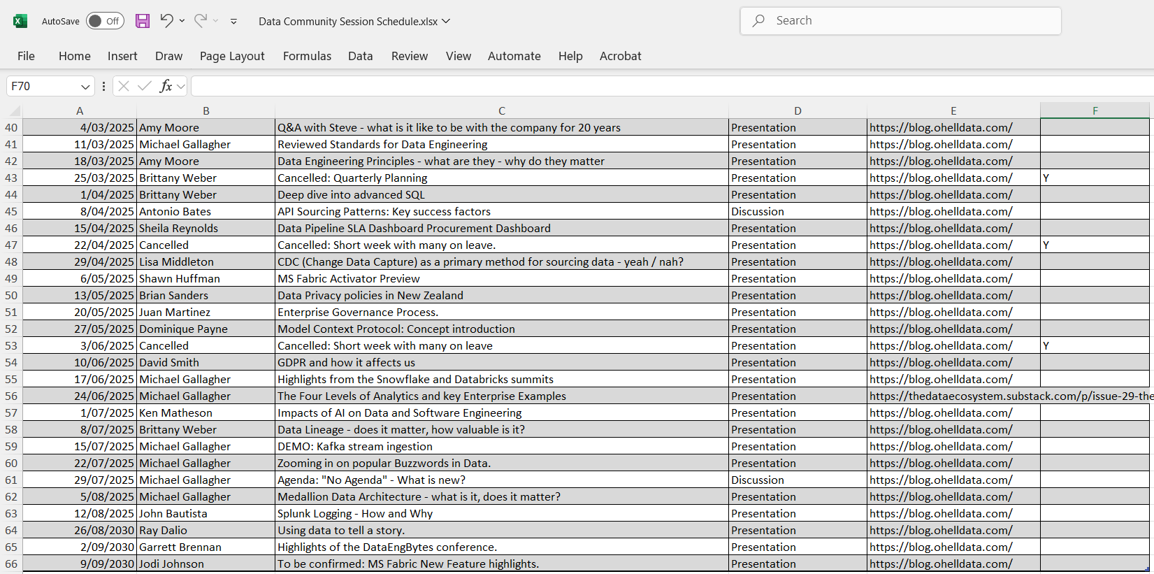
Session schedule. I use a simple Excel Workbook with a table (Ctrl + T), which is recommended for Power BI import (so that Power Query knows the boundaries of where data begins and ends):
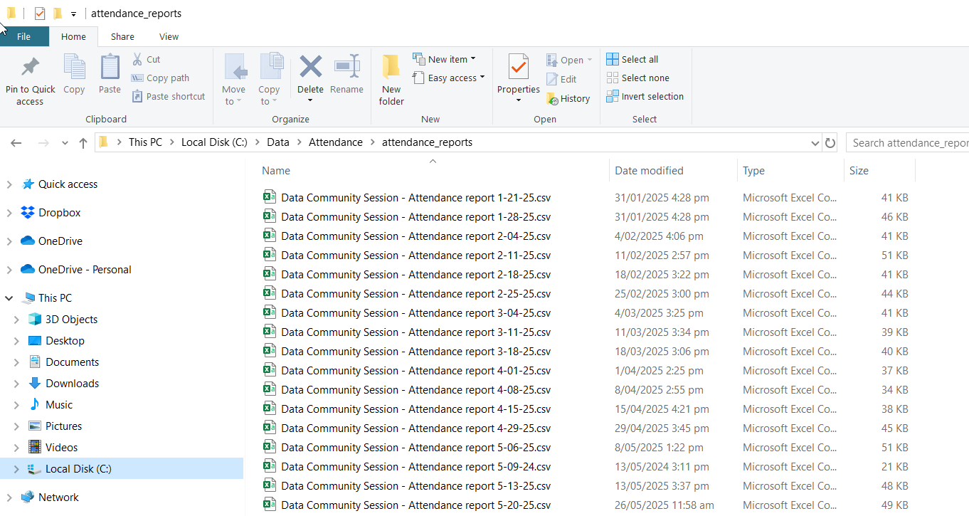
Attendance report CSV files are all collocated in a single folder to allow Power Query to iterate and automatically pick up new ones:
And this is what each of them looks like inside:

Source Code
The Power BI Project file (as well as the sample data) is available for download at my GitHub project here - have a look, get inspired or build one from scratch - it’s fairly easy.
I’ll admit that setting up the Report to be reusable is a bit of a pain. The default query setting is configured to read files from the local drive, as I presume not everyone will have SharePoint Online available to them.
Power BI Projects are in Preview still at the time of writing, but are very useful to store Power BI artefacts as code and track changes in Git.
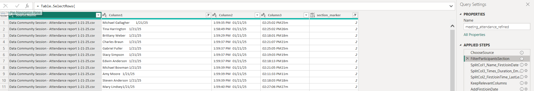
Detecting the Participant section in the source files
The one bit of secret sauce from Power Query I’ll share is the bit where you dynamically identify the section of an attendance report to only pick the Attendee details.
You start in the sample file query with:
conditional column based on starting characters of first column (1 for 1., 2 for 2., etc)
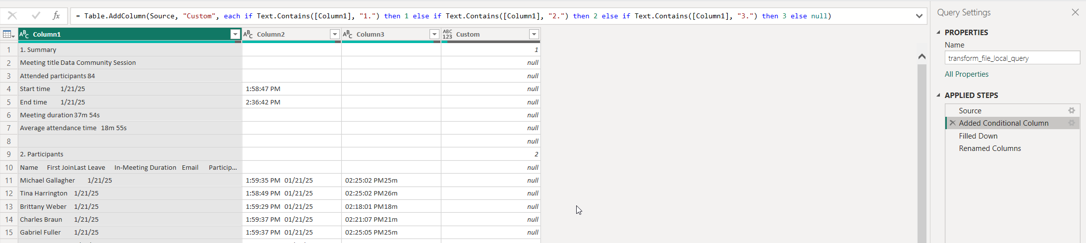
fill down function to populate all lagging NULL values in the same column
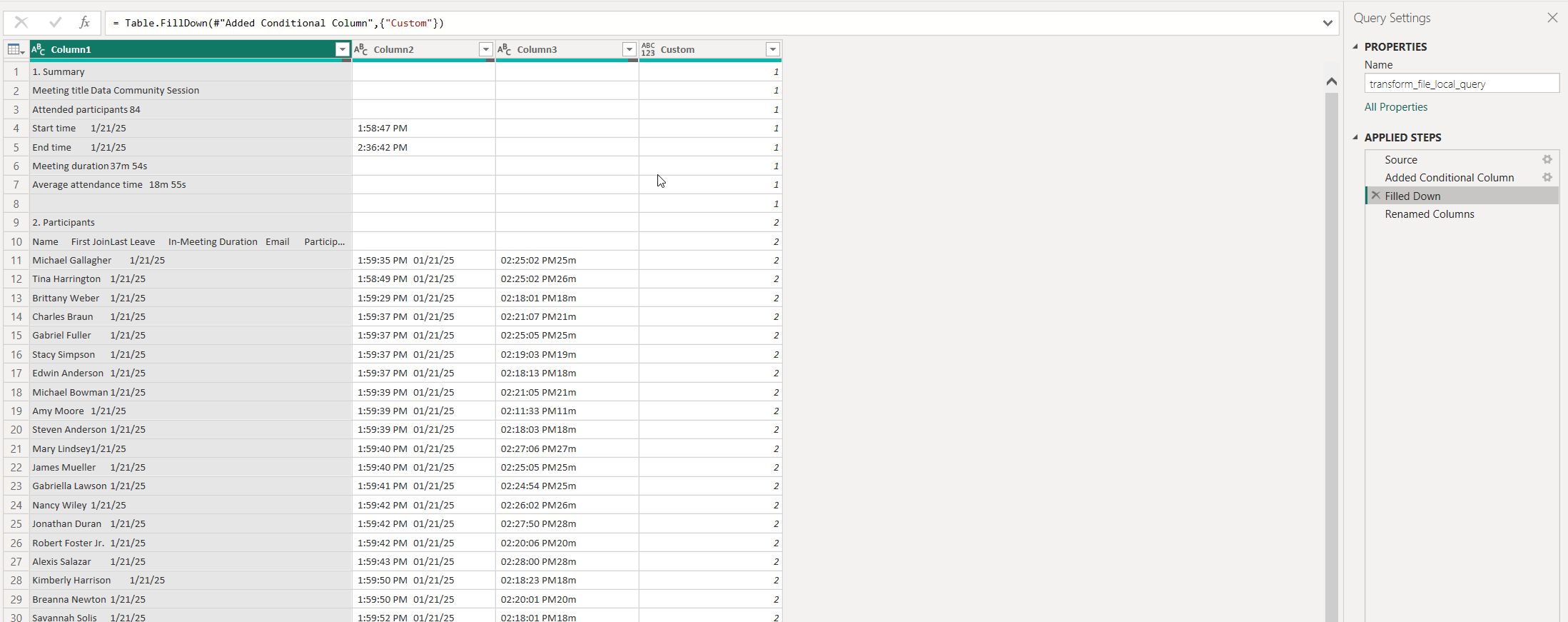
This then allows you to filter out the participant section, which has a different number of rows depending on the given attendance report
The rest is just calculations and enhancements to enable the creation of the insights above.
Future improvements to consider
There are several areas for improvement that you can choose to pursue:
Automation
Yes - there is a manual data export involved. It does take about 5 seconds, though, and if the report is on a schedule, that’s all you really need to do. MS Teams does have an API, though, so equivalent data could be obtained in an automated pipeline and stored to cloud storage or SharePoint. I preferred to stick to a solution that required only Power BI Desktop to run and nothing else (it’s free, remember?).
Data Enrichment
This model lends itself quite nicely to be combined with your organisational structure dataset. This will allow you to slice the numbers by teams and departments.
Microsoft Teams Premium license unlocks further insights into in-meeting activities, such as being on the microphone, reactions and more - this would further enhance the measurement by not just taking in attendance, but also active engagement and interactions.
That’s a wrap
I hope you’ve enjoyed the read and the DEMOs. Next time, I’ll have a crack at discovering further insights and recommendations for improvement with using LLMs (Large Language Models).
Stay tuned.